The future looks bright (like, really bright) for color lovers. When it comes to color trends, we’re seeing way more consistency across design disciplines this year. Social media platforms like Instagram and Pinterest have enabled trends to emerge from a global design consciousness. And industry experts are taking notice, incorporating these emergent color trends in their designs to add more variety and reflect the aesthetic taste of the masses.
This year’s diverse spectrum of color trends has a little something for everyone. From bold, vibrant technicolor to pretty (and punchy) pastels and an assortment of new neutrals, you’re guaranteed to find the perfect palette for your project in 2018. These are the color trends you can expect to see everywhere this year:
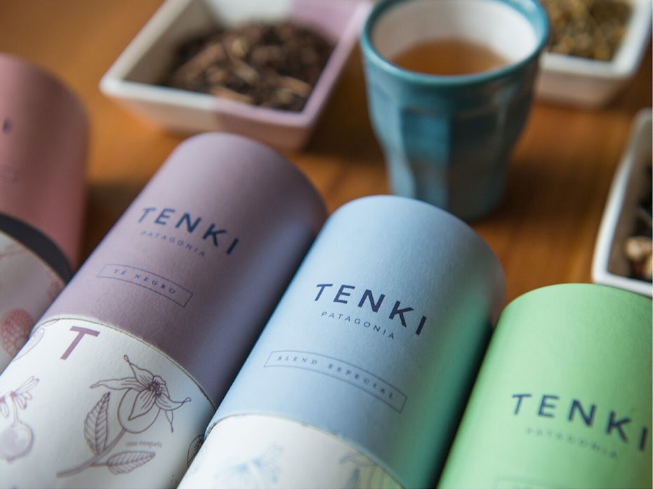
1. Pretty practical in pink
—
Simone Hodgskiss of Pearly Yon
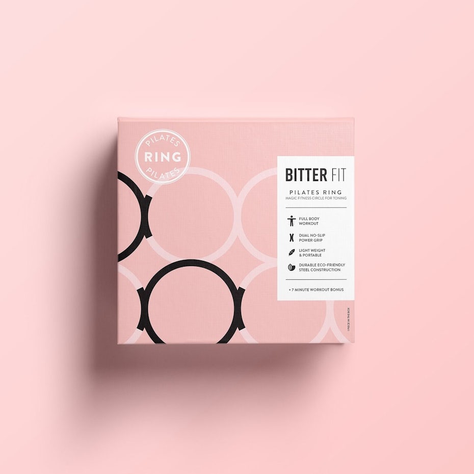
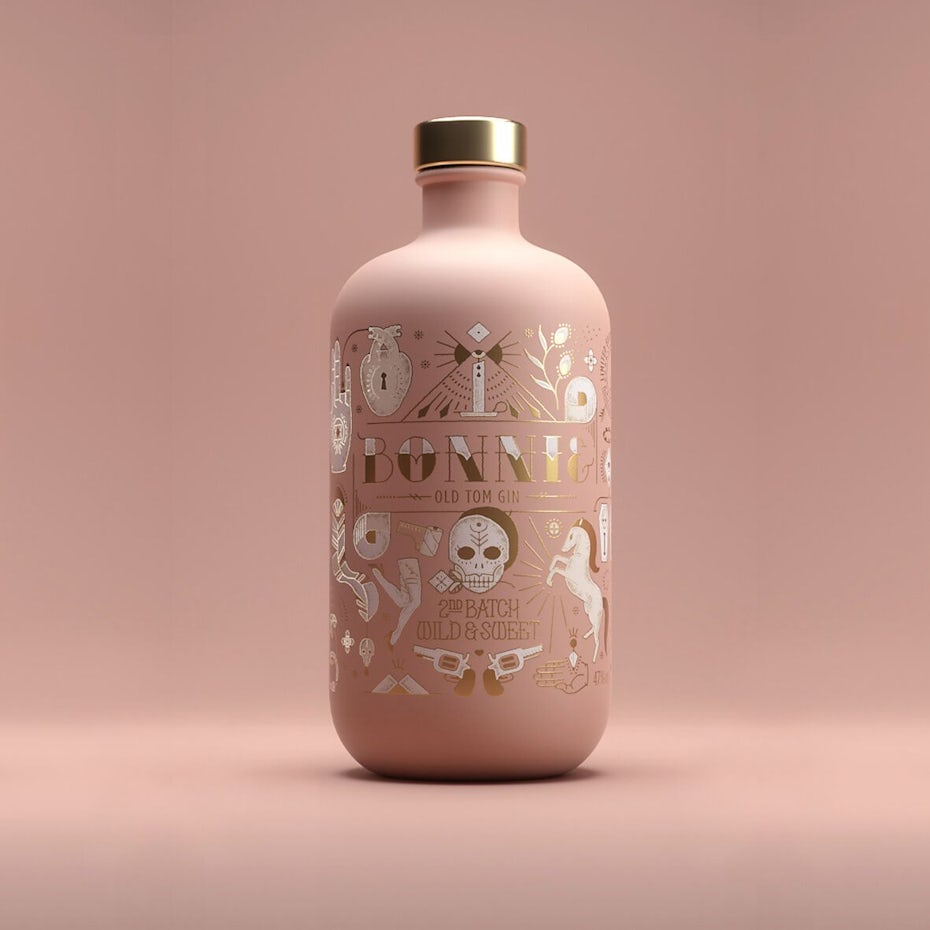
Pink has become one of the most ubiquitous and versatile colors of the decade. Its modern rise to fame began on Tumblr as content creators across the platform widely adopted the color, which became known as “Tumblr Pink”. The resurgent popularity of pink quickly reached mainstream status and began to take the design world by storm.
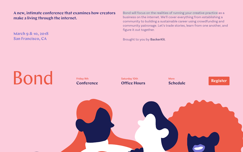
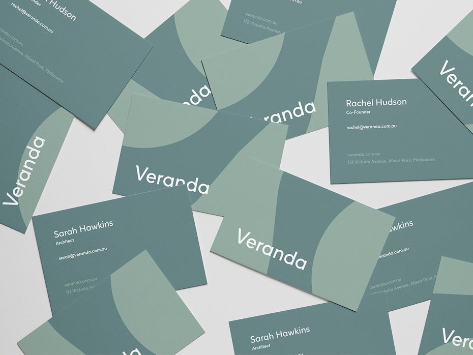
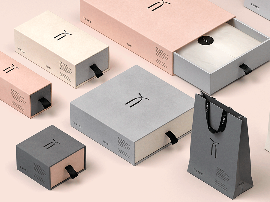
By 2016 the favored pink palette evolved from bubble-gum tints to the spectrum of blush, ashy rose and salmon hues we know today as “Millennial Pink”. Through its versatility, commercial popularity and staying power, Millennial Pink has transcended traditional gender connotations to become an androgynous “new neutral” associated with an entire generation.
When the Pantone Color Institute (the global authority on color) named Rose Quartz and Serenity colors of the year in 2016, many trend watchers claimed pink had peaked. To the contrary however, pink refuses to fade as the trending spectrum continues to expand. With vibrant technicolor palettes in the forecast this year we will be seeing it as a statement color (think Instagram) as well as an alternative neutral. Expect a continued adaptation and evolution of the color pink.

2. Metallics as neutrals
—
At the 2017 International Home + Housewares Show the Executive Director of Pantone, Leatrice Eiseman shared her insights on color in 2018 and told her audience that “Metallics we know are classic, but they have really moved over into neutrals.” It’s easy to see her reasoning behind this statement.
Metallics are standard in interior and fashion design as they have the unique ability to mesh beautifully with a broad range of color palettes and design trends. From minimalist accents and effortless pairings with natural materials to being the epitome of glamour and luxury, metallics have proven they really can do it all.
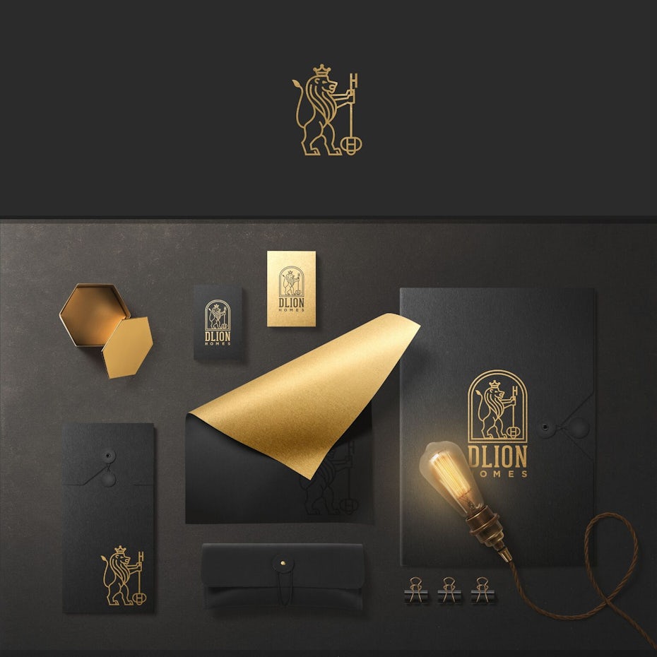

Despite their commercial appeal, metallics have not achieved the same status in graphic and new media design—yet. Likely due to the difficulty of accurately representing them on screen, they’ve typically been reserved for luxury products and label design. Recently however, metallics have been gaining popularity in visual brand design—particularly for fashion, beauty, and lifestyle brands as companies seek to evoke the trending aesthetics of their industries within their identities.
So no matter what your design discipline, you can add a little shine to your designs in 2018 using this versatile palette of new metallic neutrals.
3. Bright and bold
—
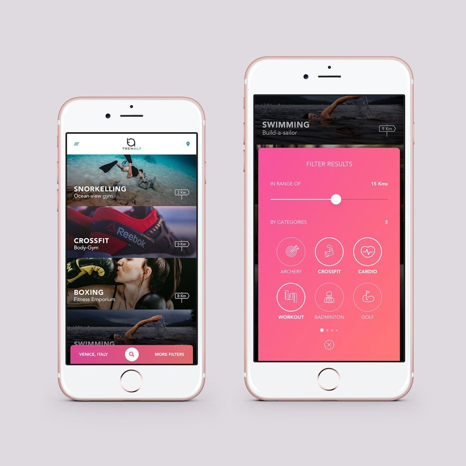
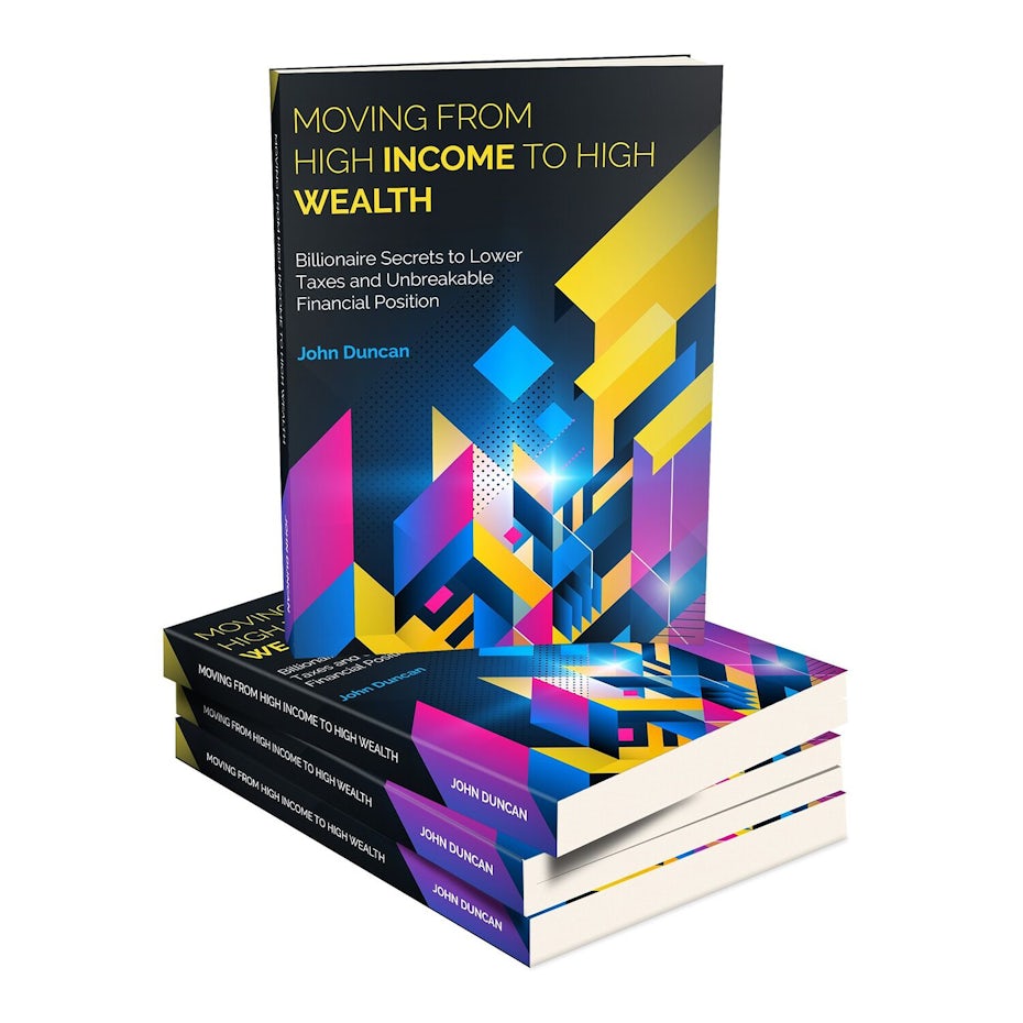
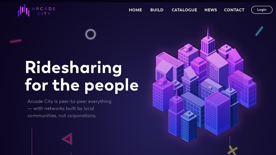
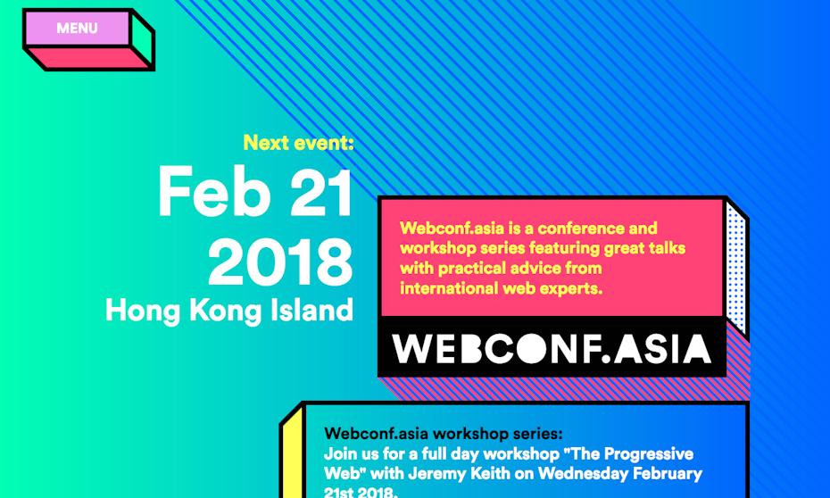
Bold color has been trending in web and app design for years and this will continue in 2018. A staple of the flat design movement, the introduction of Google Material Design’s vibrant palette in 2014 further solidified the trend making it the standard in new media.
“As consumers continue to embrace color, designers are recognizing the need to show more color in their collections.”
As flat design evolved into flat 2.0 the use of vibrant color reigned and the recent reintroduction of modern gradients will take this trend to the next level. Expect a plethora of electric 80’s technicolor, hot tropical palettes and iOS-inspired color transitions in the coming year.
The technicolor invasion didn’t stop at pixels as more brands are adopting eye-catching hues for their visual identities. Spot color aside, print has limitations in reproducing vibrant color so proceed with caution when considering this trend for use offline. For the increasing number of brands that live predominantly online however, this has become less of a hurtle.
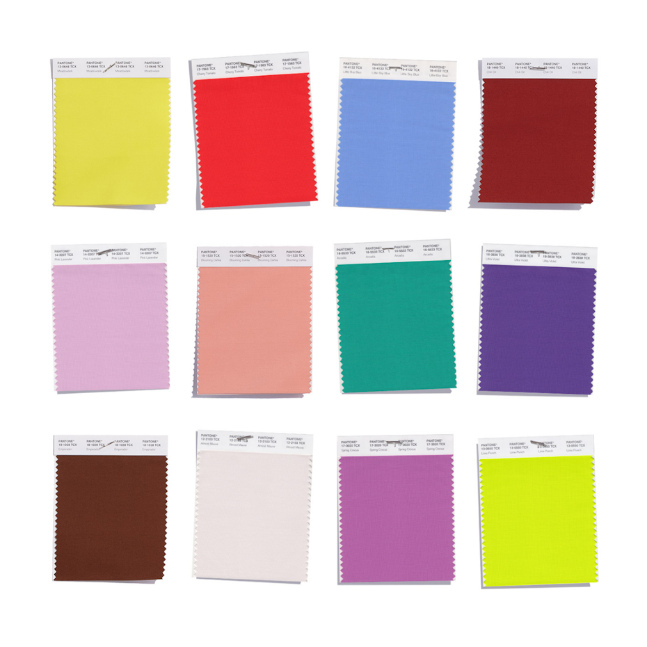


Though not quite as electric, bold color is also making a prominent appearance outside of digital design as well, as Pantone announced a few eye-popping selections in the PANTONE® Fashion Color Trend Report Spring 2018 edition for New York Fashion Week to cater for ”consumers’ ongoing fascination with color”. This is hardly an understatement as vibrant hues like Meadowlark, Cherry Tomato, Ultra Violet and Lime Punch made the cut.
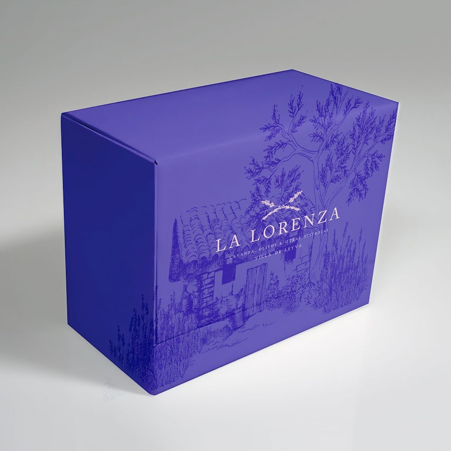
4. Pantone’s color of the year: ultra violet
—
We’ve established that bold and beautiful color is in for 2018 and according to the Pantone Color Institute, Ultra Violet will be the hue to rule them all.
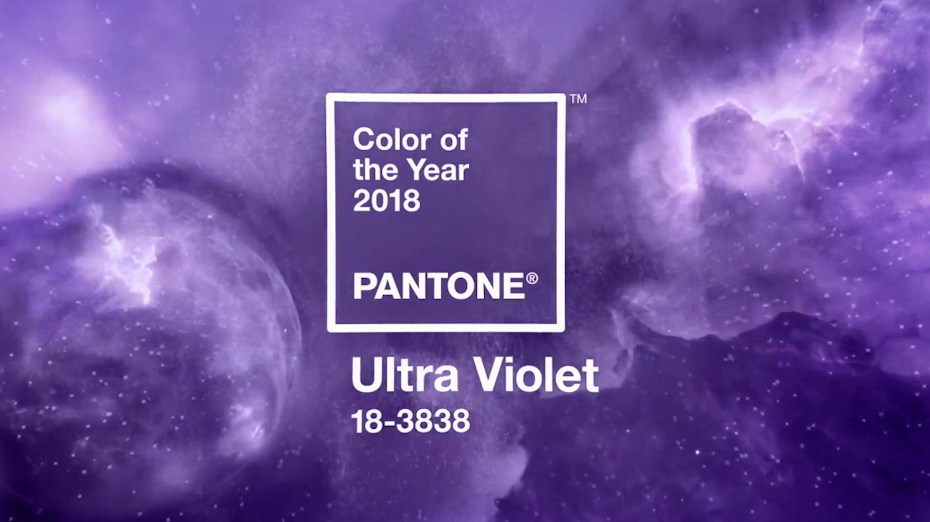
“The Pantone Color of the Year has come to mean so much more than ‘what’s trending’ in the world of design; it’s truly a reflection of what’s needed in our world today.”
Pantone describes this particular purple shade as “dramatically provocative and thoughtful” and further explains that “…purples have also long been symbolic of counterculture, unconventionality, and artistic brilliance. Musical icons Prince, David Bowie, and Jimi Hendrix brought shades of Ultra Violet to the forefront of western pop culture as personal expressions of individuality.”
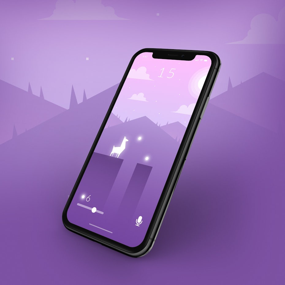
While Pantone’s selection may seem surprising to some, digital media designers have witnessed vibrant violets become a popular color choice in recent years, especially in web and mobile app design. With its official “Color of the Year” status, we can expect this trend to gain steam in 2018.

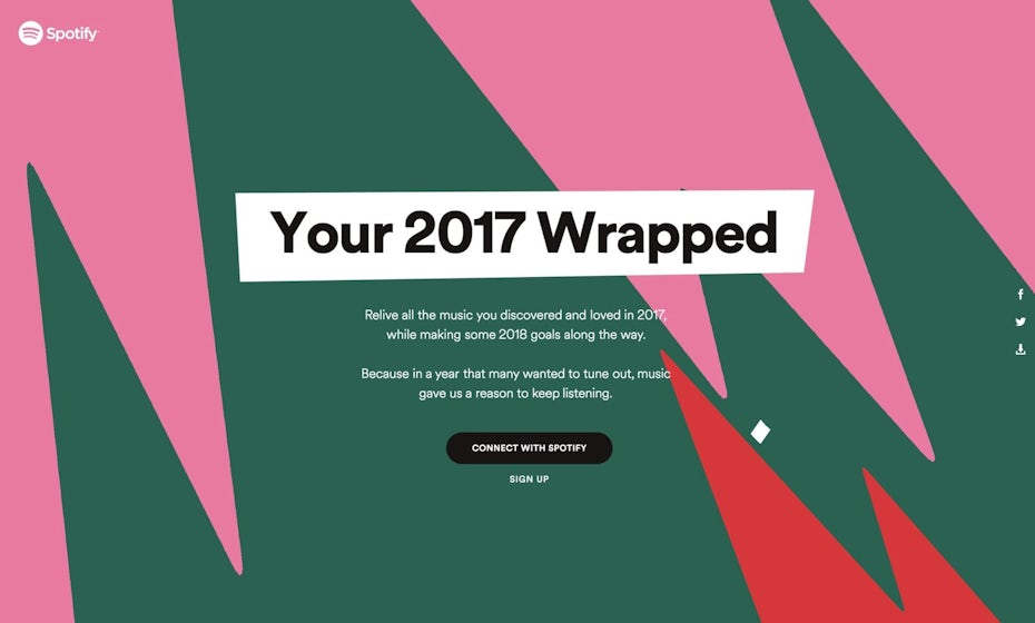
5. Modern gradients
—
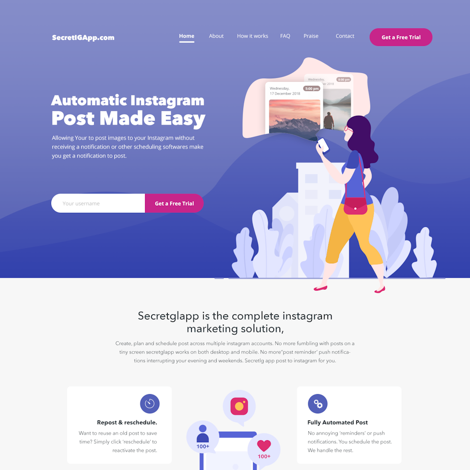
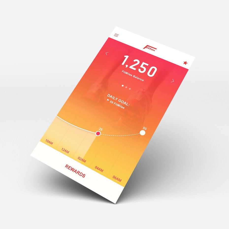
Gradients are making their modern-day comeback as a semi-flat design enhancement and are predicted to be one of the biggest graphic design trends of the year. Semi-flat design (a.k.a “flat 2.0”), combines the best qualities of the flat design movement with additional cues like gradients and shadows to improve functionality and user experience.
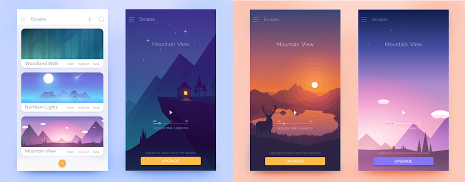
Their return to iOS and adoption by industry leaders like Instagram, Stripe and Spotify have solidified their popularity. While gradients are rapidly returning to screens everywhere in the form of vibrant UI, backgrounds, illustrations and overlays, the trend has already spread to print design and visual brand identities.
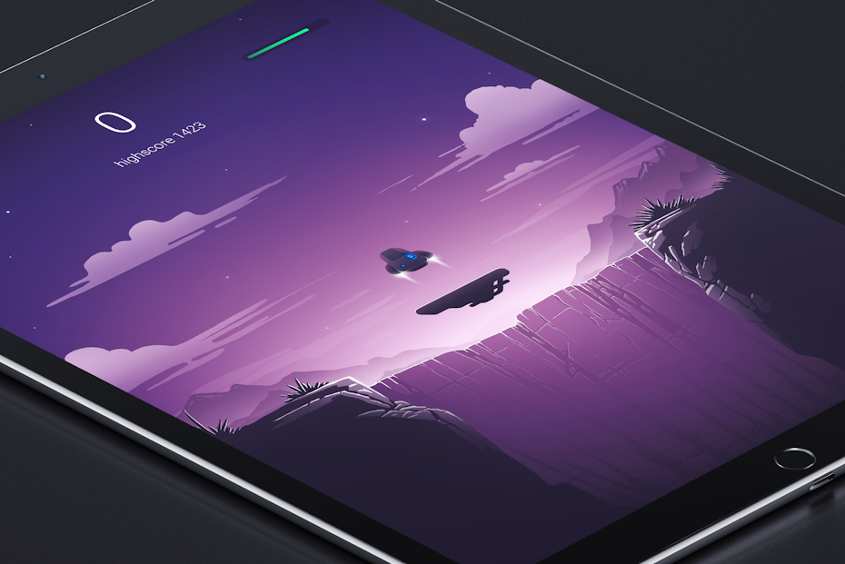
Modern gradients are beautiful and can be subtle or extremely vibrant color transitions. With bold technicolor palettes on the menu this year, gradients can be an excellent way to make the most of your plethora of color options in 2018.

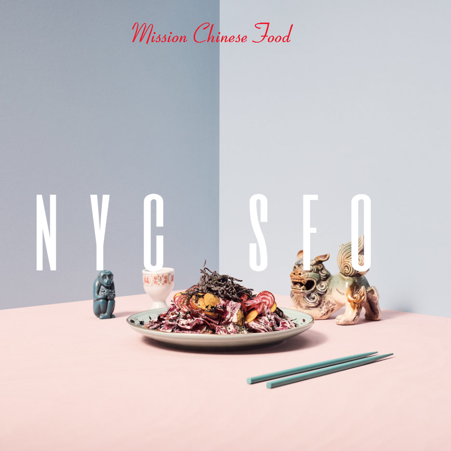
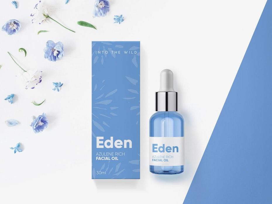
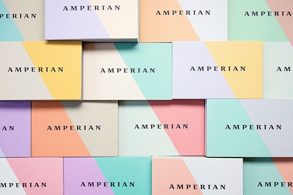
6. Pastels: the new minimalist palette
—
Minimalism is a core value of hipster counterculture—less consumption, less waste, less stuff—and with their affinity for Scandinavian style (and its predominantly white color palette of the time) that meant less color too. These “hipster aesthetics” emerged prominently in interior, graphic and new media design, resulting in an overabundance of whitewashed walls and websites, and black and white branding.
When it comes to color, we will see pushback in 2018 with a rise in modern pastel palettes—sandy Scandi pinks, mint and sage green tints, taupes and stormy blues will be replacing generic grey and breaking up the white surplus.
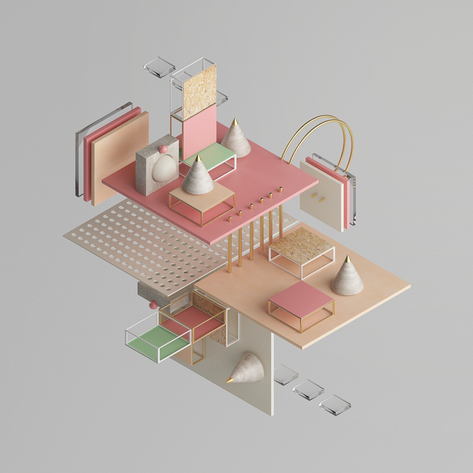

Palettes we often refer to as “farmhouse chic” are also commonly found in Scandinavian interior design, proving they can pair effortlessly with minimalist aesthetics. Given their tried and tested success in minimalist interiors, they make a great choice for the reintroduction of color into whitewashed graphic design as well.
If you’re feeling a little more adventurous, palettes of “punchy pastels” are gaining some serious steam as well. Made famous by the beauty industry through rainbows of luscious pastel locks, electric eye color and stand-out nail art, we’re seeing brilliant pastels make their move into other disciplines. Shutterstock (a global image licensing platform) announced these ice cream and candy colors as one of their top 11 styles to emerge in the coming year. This prediction is based on search and download data aggregated from their platform. Spring runways are forecasted to host these hues in abundance and with vibrant color trending in digital design we can assume they’ll make an appearance in pixels as well.
While black and white will forever be a popular and desirable classic, in 2018 you can inject more individuality into your minimalist designs using a broad spectrum of pastels.

7. Brutalism: the good, the bad, and of course—the ugly
—
Brutalism is seeing a niche revival in web design. Brutalist websites are raw and often use “ugly” as a design statement making designs intentionally unpleasant and uncomfortable to look at. While brutalist web design may be viewed as an artistic and nostalgic nod to the early days of the web, ultimately it’s a rejection of current design ideals like functionality, simplicity and aesthetic perfection.
Color is a major component in making a brutalist website brutal. Intense colors, uncomplimentary schemes and overall color theory chaos are the order of the day in creating a design that is truly uncomfortable. We can expect to see some peculiar palettes emerge from this trend. Like with many web design trends, we can also expect expansion into other areas of design resulting in avant garde visual identities and a revival of raw graphic design for those brands brave enough to embrace aesthetic anarchy.
For companies looking to dip their toe in the trend without sacrificing user experience (because let’s face it, conversion rates are seriously important guys), Dropbox’s recent and daring redesign demonstrates how you can capture the essence of brutalism through color without sacrificing usability. This unique form of “brutalism-light” does have a certain je ne sais quoi, creating designs that are both unique and memorable. Love it or hate it, brutalist-inspired color is a surefire way to get noticed this year.
8. Black is the new black
—
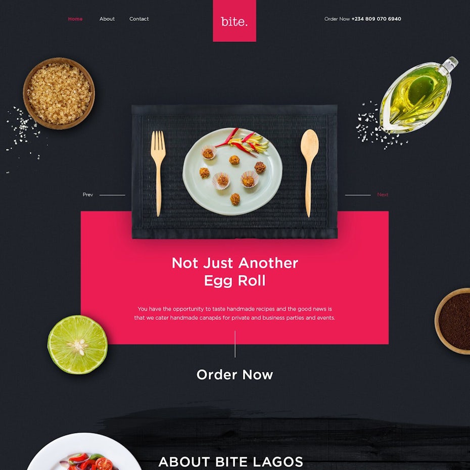
Black is the ultimate neutral. It can be sexy, sophisticated, edgy or mysterious and everything in between. Black has the unique ability to fade into the background or be used as a statement color while effortlessly integrating into almost any design style. If you’re thinking “wait a minute, black isn’t a color”, you’d technically be correct if we were talking about basic black, but in 2018 we’re looking at modern black shades with rich charcoal and indigo undertones.
“Unique shades of black make a statement and work beautifully with all of the year’s hottest color trends.”
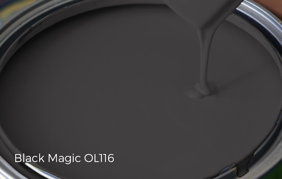
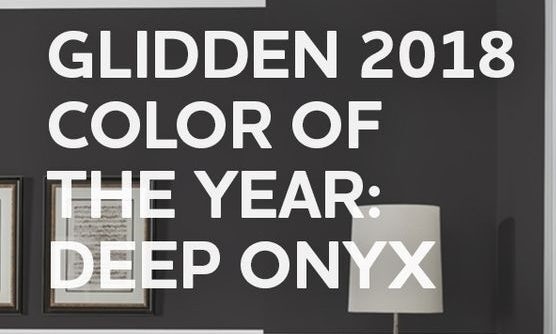
While Pantone opted for Ultra Violet this year, PPG (a global supplier of paints, coatings and industrial materials) and prominent paint brands Olympic and Glidden (a PPG company) have all announced shades of black as their pick for color of the year in 2018. PPG’s Black Flame is described as an “unprecedented, statement-making black with deep tones of indigo.” Olympic’s Black Magic is more saturated and charcoal but follows suit being described as the “perfect mix of masculine and feminine”. Glidden characterizes their color of the year Deep Onyx, as “Just like a little black dress… a classic, timeless staple.”

The best part about black’s popularity this year is that it not only applies to all design disciplines, it works beautifully with almost all of the year’s hottest color trends:

2018 is the year to be bold and color outside the lines
—
Color lovers rejoice—2018 is going to be an exciting year! With so many fresh and punchy palettes and the continued evolution of old favorites, this year’s trends are inclusive of all aesthetic tastes. Whether you’re a designer, DIY-er, or selecting swatches for the guest room, color outside the lines this year and explore color as a form of self-expression.
Original article and pictures take https://99designs.com/blog/trends/color-trends-2018/ site
Комментариев нет:
Отправить комментарий